First attempt downloading and decoding NOAA images
Introduction
In the past few years I have wanted to explore the world of different signals from space. Now, I know that my phone can pickup signals from space, and I use it every day… it’s called GPS. Unfortunate as much as GPS is an intriguing and marvelous system it’s a very simple signal that does not very interesting data. For a few years now, I have been aware of meteorological satellites using the APT system (mostly US NOAA satellites) that transmit many types of information.
- NOAA-15 - Launch May 13th 1998, (Designated NOAA-K).
- NOAA-18 - Launch May 20th 2005, (Designated NOAA-N).
- NOAA-19 - Launch February 6th 2009, (Designated NOAA-N’).
As the dates suggest the newest satellite is already 11 years old, and the oldest is about 22 years old. Therefore before the satellites degrade to a point the’ll be retired, I want to receive, record, explore and decode an APT signal before I loose the chance.
Hardware and Software
The first thing I had to do was to record a signal, by looking at different resources such as Wikipedia, Datasheets and other online resources I found that the signal is transmitted at the 137MHz frequency (with some shift depending on the actual satellite passing). This is excellent as I already have 2 receiving SDR dongles that go up to 1.7GHz and access to a few more SDR platforms that can got from 70MHz to 6GHz. Next I had to decide on an antenna, there is no shortage in antenna types and designs. Most resources state that a QFH antenna is needed, but for a proof of concept only a simple dipole can be used, so I decided to go with the dipole as it’s the simplest antenna to find or construct.
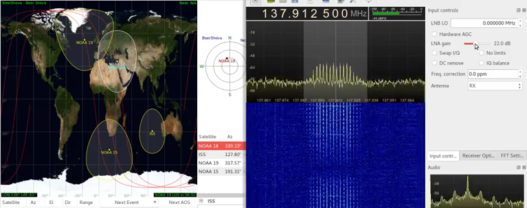
On the software side of things, I used two main pieces of software, first was Gqrx SDR as the receiver frontend, and Gpredict to track the movement of the satellites, pass times and pass details. I also set up OBS to record my display so I could benefit from some hindsight later when I analyze any mistakes I made.
The final (working) setup consisted of a dipole antenna with the two sections measured out to approximately 54cm (1/4 wavelength of 137MHz) connected to a SDR dongle feeding into a a laptop running Gqrx SDR. In Gqrx I tuned the main frequency to 137.1MHz (NOAA-19) I also had to set the gain to maximum, modulation to narrow FM and a filter width of approximately 45kHz. I decided to only try to receive the signal when the satellite was crossing overhead at a high elevation, this was good as it reduced the number of parameters for me to debug when it all went wrong.
If you have either read up or received a APT signal before, you may be asking why I did not setup WXtoImg or anything similar. The answer to that is that I as I’m using a Linux system to receiver the signal, I could not be bothered in setting up the audio piping needed.
It’s a signal! From space!
At total, I had tried 3 different attempts at receiving the signal. The first time I tried, I took at my gear and headed of to a good, open and quiet area. Assuming I am getting away from any unwanted noise sources, unwanted transmissions and any reflections from nearby objects such as buildings. So there I was, in the freezing cold winds holding up an antenna trying to receive the signal… and I failed. It’s not that the signal was faint, I had noise or the hardware just didn’t want to work, I just could not see any signal at all, apart for a random burst of data every here and there at 139ish Mhz. After reviewing my recordings and looking at the settings, I relized gow stupid I was, I failed to turn up the gain on the receiver, so the only thing I was reviving was noise.
After some face-palming and hating myself for being so stupid, I decided to have a second try. It was already dark and I decided I will not drive to the location I was previously for the first attempt, until I saw something that was worth the small drive. For my second attempt I reset my setup and just shoved the antenna out of the window, and surprisingly, it worked well enough for where I was, as I was located high enough in an area of mostly low buildings and had the satellite directly in line for at least 50% of the pass. Eureka! I got a signal!
Since the second attempt worked so well, and it was at night, I decided to test my luck and try exactly the same setup (hanging out the window) at daytime (well, late afternoon, on a very cloudy and gloomy day). Amazingly this attempt also went well, and I got a good signal recorded.
Even though I want to be able to decode and view the signal myself, as a sanity check I put the signal through WXtoImg to make sure the signal was valid and I will not be wasting my time trying to decode static. I installed WXtoImg and put the recorded signal through it to process. After some time I got a good result, the software decoded the image, which means I have a valid signal in hand (with a fair bit of noise). If you want to hear how the signal sounds here is a 10 second audio file:
So how APT exactly works?
Now that I have a signal in hand, I was eager to look and understand the signal myself, before I continue and play with the signal, I need to know what I am looking for. So how does someone know to decode a signal send from a satellite? Well, there is a users guide, how handy. The user guide for NOAA satellites is called NOAA KLM Users Guide and even though the name suggest its only for NOAA-K,L,M (NOAA-15,16,17) the first paragraph assurs it’s also valid for the NOAA-N nad N’ (NOAA-18 and 19) satellites:
The NOAA KLM User’s Guide is a comprehensive document describing the orbital and spacecraft characteristics, instruments, data formats, miscellaneous but pertinent information of the NOAAK,L,M,N,N’ satellites, as well as, the Metop series satellites as it pertains to the NOAA instruments.
According to the user guide, the channel presents 2 images side by side, these 2 images are any of 6 channels that the AVHRR/3 (Advanced Very High Resolution Radiometer/3) imaging module produces. According to the user guide, these 2 channels are selected by ground control, but are usually set to transmit a near-visible and IR (Infra Red) images during the daytime (if the earth under the satellite is illuminated by the sun). At nighttime, the near-visible image is replaced with a second IR image.
Now, just to be fair, here is where it all get a bit complicated and hard to explain. First, a bit terminology:
- Word - A single sample, equivalent of a single pixel (carry a value from 0 to 255).
- Line - A single scanline of a full frame.
- Frame - A set of lines which complete one data set (image).
- Wedge - A set of words that act as telemetry.
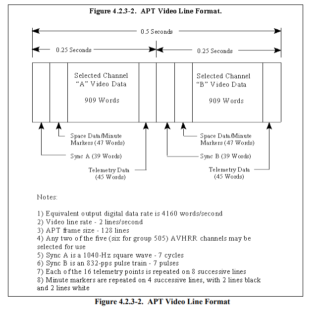
In order to understand how the signal is translated into an image, first the signal need to be examined. The signal that is transmitted is modulated on a 24000Hz AM subcarrier on top a FM carrier. As I’m looking into the signal, I only look at the AM subcarrier signal. Each frame in the signal consists of 128 lines, which are transmitted at 2 lines per second, meaning, a full frame takes 64 second to be transmitted. Each line is 2080 words in length, and these 2080 words are divided into different section, these sections, over several lines are what create the “columns” effect. Below is an image from the NOAA KLM Users Guide describing a full frame:
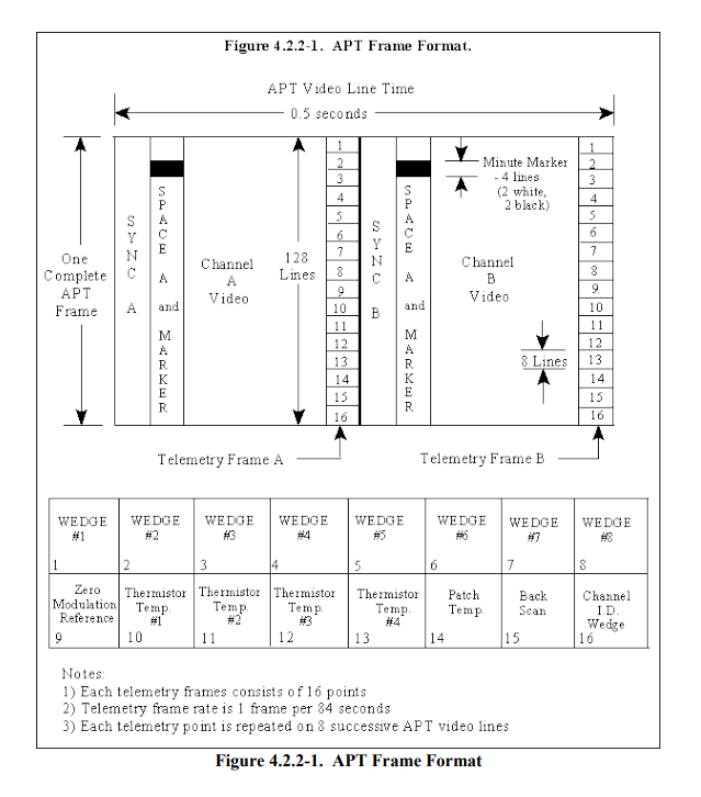
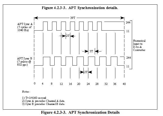
As can be seen, the 2080 words per line are split into 2 similar sections, Channel A and Channel B each line begins with a SYNC A which is 39 words is length, looking at Figure 4.2.3-3 reveals that SYNC A is comprised of 7 cycles of a 1040Hz square wave. Next a SPACE A/MARKER section which consists of 47 words, this section is usually blank, but every minute a marker is place, the marker consists of 2 white lines and then 2 black lines. After that, the Channel A Video image data is transmitted, 909 words wide, finally (for channel A) the telemetry WEDGE of 45 words is transmitted (this section is repeated the same for 8 lines before changing).
All of that was only the first channel of a single line (so far 1040 words). After that, for channel B the format repeats, the only differences to note are that the SYNC A is replaced with SYNC B, which is 7 pulses of a 832pps pulse train and that the telemetry is formatted differently, all together making up another 1040 words to complete the 2080 words per line. 128 of these lines and we have a single frame of 2080x128 words.
So far, everything is understandable and straight forward, except the mysterious Telemetry WEDGE, so what are these wedges?. Since each frame has 128 lines, and each wedge is repeated for 8 lines, this creates 16 wedges changing in intensity along the vertical axis of the frame. Each wedge has a purpose. The first 8 wedges are used as a guide for calibrating a ration between the amplitude of the signal and the digital equivalent. The first wedge starts with the value of 31/255 (255 levels / 8 wedges) and climbs to 255/255. The 9th wedge, named zero modulation reference is equivalent of 0/255, defining what is a 0. These 9 wedges together define a amplitude to digital grayscale. These first 10 wedges are the same for every frame, the remaining 6 wedges (10-15) are calibration data, and the last wedge (16) is the channel identification wedge, used to determine which of the 6 channels of the AVHRR/3 instrument is presented, this is done by comparing it to wedges 0-9 (each wedge corresponding to a different channel on the AVHRR/3).
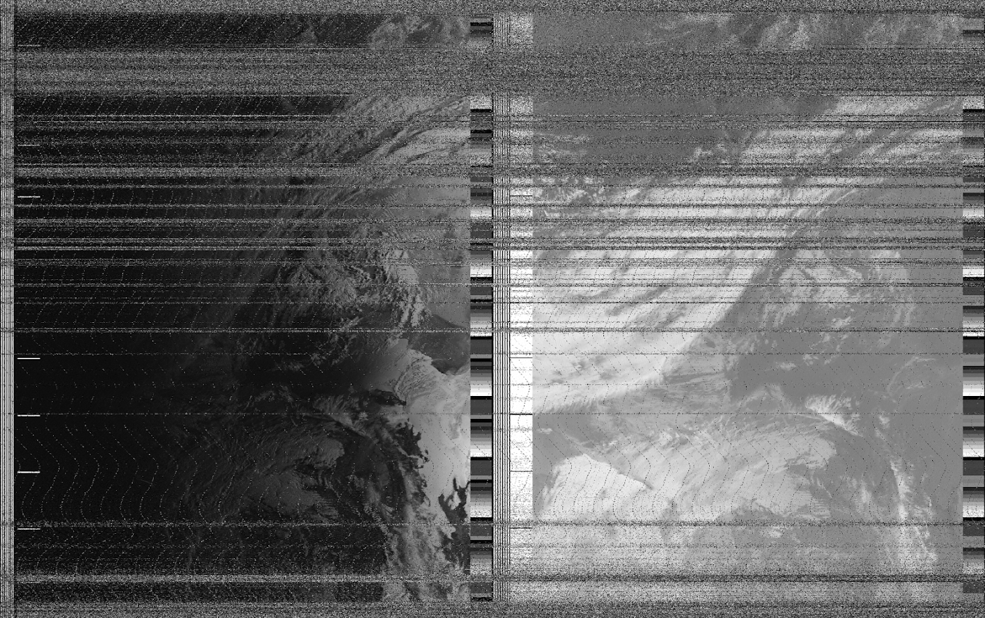
In the image below, I have highlighted the components of the APT frame on part of an actual image I decoded. Red is the SYNC A/B, Orage represents the SPACE A/MARKER (note the 2 white/black lines marking a minute), Yellow is Channel A/B Video and green are some of the Telemetry WEDGEs. It’s also interesting to notice that how the telemetry wedges are diffrent between the two channels, and on a close inspection, a diffrence i the SYNC A (red on the left) and SYNC B (on the right) can be seen (such as the thicker rightmost black band).
Inspecting the signal with python
Now that all the theory of the signal is out of the way, I decided to look at it and examine it with python. The first thing I did was to find a clean area of the signal with as little noise as possible. The original signal I recorded is 12 minutes and 48 seconds in length, and starts and ends with a lot of noise. I used sox to cut a portion of clean signal out of the full recording, I cut from 6:25 to 6:35 with sox noaa_original.wav noaa_trim.wav trim 6:30 10 this gave me 10 seconds of signal, containing 20 lines of a frame. I then loaded it it up into python using scipy and displayed the signal using matplotlib. The first thing I noticed was that my wav file was in stero, this is not really good and can mess up the processing, so I selected only the first dimension of the signal and worked on that.
import scipy.io.wavefile
import matplotlib as plt

raw_rate, raw_data = scipy.io.wavfile.read('./noaa_ord_trim.wav')
raw_data = raw_data[:,0] # Discard extra channels (monofy)
plt.figure(1, figsize=(10,4))
plt.grid(True)
plt.title('Signal (RAW)')
plt.xlabel("Sample")
plt.ylabel("Amplitude")
plt.ylim(-20000, 20000)
plt.plot(raw_data)
plt.show()
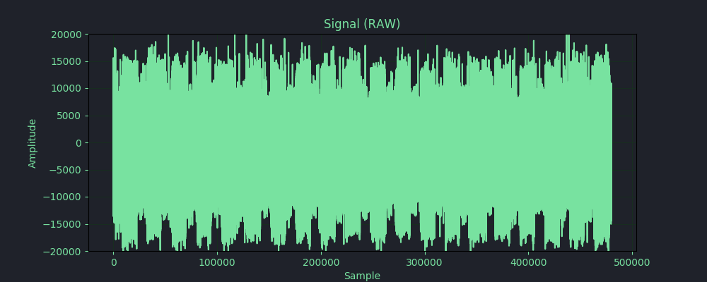
As can be seen in the signal plot, the signal is still noisy and dirty even though I cut a relatively clean section from the recording, I used a bandpass filter in order to clean up some of that noise. After the filter, the signal looks much cleaner and can be viewed and worked on and is ready for further processing. Another thing I though would be interesting is to pipe the signal back out the speakers of the computer to hear the differences in the signal, this was accomplished using Audio(raw_data, rate=48000) from the IPython.display module.
import scipy.signal
def butter_bandpass(lowcut, highcut, fs, order=5):
        nyq = 0.5 * fs
        low = lowcut / nyq
        high = highcut / nyq
        sos = scipy.signal.butter(order, [low, high], analog=False, btype='band', output='sos')
        return sos

def butter_bandpass_filter(data, lowcut, highcut, fs, order=5):
        sos = butter_bandpass(lowcut, highcut, fs, order=order)
        y = scipy.signal.sosfilt(sos, data)
        return y

filtred_signal = butter_bandpass_filter(raw_data, 1000, 2400, 48000, 5)
plt.figure(2, figsize=(10,4))
plt.grid(True)
plt.title('Signal - Bandpass filter')
plt.xlabel("Sample")
plt.ylabel("Amplitude")
plt.ylim(-20000, 20000)
plt.plot(filtred_signal)
plt.show()
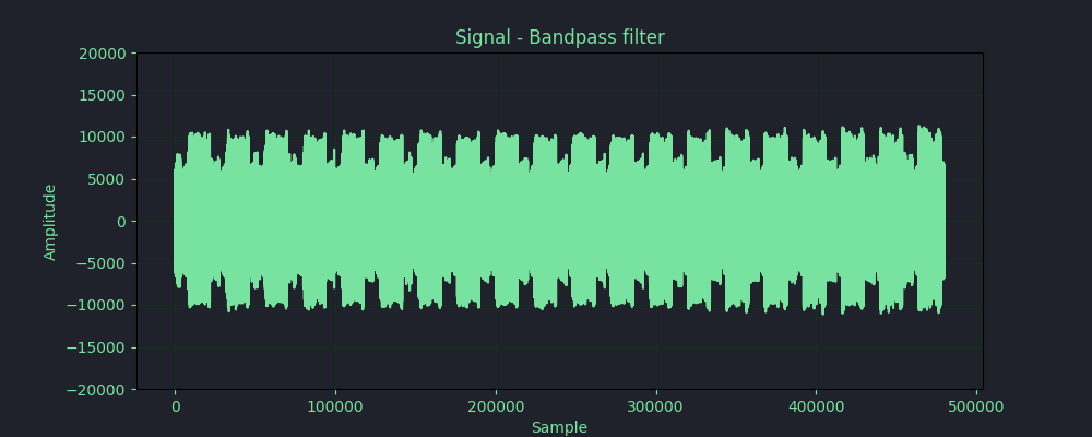
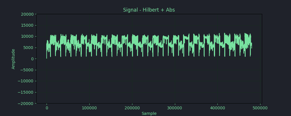
As can be seen in the image above, the signal is much cleaner after the bandpass filter. From this stage, I can transform the signal as much as I want and use it to either generate and image, or even just visulize different aspects of the signal. The first thing I wanted to do was to graph one of the SYNC A sections on a line, I did this manually searching for the line and graphing only the relevant section of the WAV array. In order to get a better look at the signal, I had to find a way to transform it. Now, since I’m no signal processing expert, I go some help from my friend Dan to guide me in the transformations needed to be done. Dan suggested to use a Hilbert transform and graph the absolute value for each of the data points. So, after reading up on the Hilbert transform, I did it. As can be seen in the image below, instead of the signal beeing a wave swinging between positive and negative, it’s now a series representing the absolute amplitude at each sample point. I then zoomed in on the graph and found (manually) the start of a single line of the APT signal.
lbert = scipy.signal.hilbert(filtred_signal)

plt.figure(3, figsize=(10,4))
plt.title('Signal - Hilbert + Abs')
plt.xlabel("Sample")
plt.grid(True)
plt.ylabel("Amplitude")
plt.ylim(-20000, 20000)
plt.plot(np.abs(hilbert))
# Uncomment to plot single APT line
#plt.plot(np.abs(hilbert)[8700:32700])
plt.show()
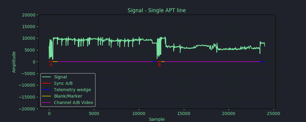
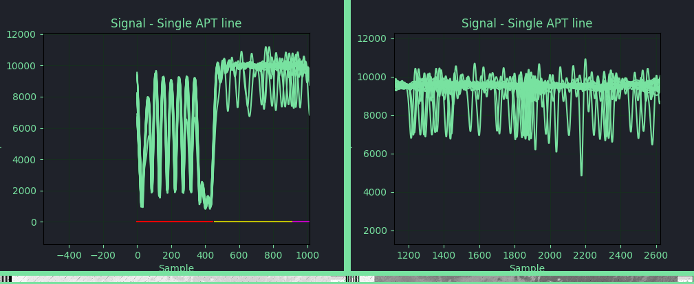
For fun, I also graphed all the lines of the APT signal over each other to see the result, I did this by taking the offset to the SYNC A and adding it to each line number multiplied by 24000 (as the sample rate is 48000Hz and there are 2 lines per second, per the NOAA KLM Users Guide). In the images below, on the left I have zoomed in on the SYNC A pulse, and on the right I have zoomed in on the Channel A video as it can be seen, the SYNC A pulses are more or less in sync with each other, but the Channel A video is verry diffrent as each line has diffrent data in that region. Interesting.
plt.figure(4, figsize=(10,4))
plt.title('Signal - Single APT line')
plt.xlabel("Sample")
plt.grid(True)
plt.ylabel("Amplitude")
plt.ylim(-20000, 20000)

max_lines = len(sample) / 24000

for i in range(int(max_lines)):
    # 8700 is the start to the first SYNC A
    linestart= 8700 +(24000 * i)
    lineend = linestart + 24000
    plt.plot(signal[linestart:lineend])
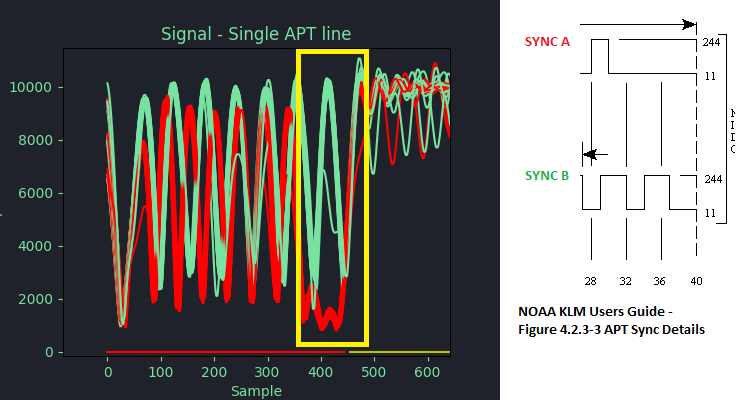
Another interesting thing I tought to do, is to plot the same as above, but instead of jumping ahead 24000 samples at a time, to only jump 12000 samples at a time. By only advancing 12000 samples, only half the line is plotted at at time, meaning, when an odd iteration is plotted, it plotting the first half of the image, and when the next, even iteration is plotted, it’s the second half of the image. This will cause SYNC A and SYNC B to be plotted over each other, and will visulize the diffrence in the two sync pulses. And as the image below shows, the diffrence in the sync pulses is very noticeable. In the yello box, I have marked where the SYNC A (red) ends and stays low, while the SYNC B (green) is still pulsing.
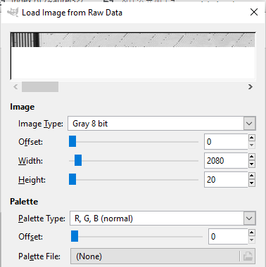
Anyway, after palying around, the next thing I had to do was to downsample the signal to somthing more managable, and also, I needed to normalize the signal, since it’s originally 8 bit grayscale (8 bit). I started by normalizing the signal and then calculated the new nuber of samples needed fo the downsampled signal, I calculated the number of samples to be 4160, this is 2x the image resolution of 2080 pixels. I used scipy’s resample method. I also experimented with scipy.signal.decimate but decided to go with resample instead. once I had the resampled and normalized signal, I could write it out to a file and see if I can open it in an image viewer. I wrote the signal out to a file as an array of uint8 and used GIMP to open the file in raw mode, I set the image settings to 8 bit grayscale and 2080pixels wide, and it worked, I got an image. I did this in GIMP for two reasons, The first, I was using a Windows machine and the second, I wanted the option to play with the hight/width sliders so I could see the effect on the image. Another good tool to use is convert from the imagemagick toolset, but as I mentioned, the option of visually playing with the settings is nice.
data = signal
# Normalize to 0-255
data *= (255.0/data.max())
# Downsample to 4160
no_samples = round(len(data) * float(4160) / raw_rate)
data = scipy.signal.resample(data, no_samples)
# Save into file as uint8
data.astype("uint8").tofile("pixels.data")
For now, I think I have a good understanding of how the APT singal is transmitted, I still have a lot more to do with this, such as writing some code to find the SYNC A automatically, clean up the image from furthur noise and use the telemetry wedges to do calibration and correction of the signal. I also would like to add an auto wedge decoder to automatically detect the 2 channels selected from the 6 of the AVHRR/3 instrument, I’ll add these features later on, but for now, I’m satisfied with the results.